VALUE ( dimCalendar[DateID] )
SummaryOrders =
SUMMARIZE (
fctSales,
dimCalendar[DateID],
“OrdersGrouped”, SUM ( fctSales[OrderQuantity] )
)
LOOKUPVALUE (
dimCalendar[DateID],
dimCalendar[DateInNumberFormat], [DynamicDate1 Value]
)
LOOKUPVALUE (
dimCalendar[DateID],
dimCalendar[DateInNumberFormat], [DynamicDate2 Value]
)
IF (
VALUE (
SELECTEDVALUE ( dimCalendar[DateID] ) ) = [DynamicDate1 Value],
300,
BLANK ()
)
IF (
VALUE (
SELECTEDVALUE ( dimCalendar[DateID] ) ) = [DynamicDate2 Value],
300,
BLANK ()
)
Next create these four measures
VAR p1 =
CALCULATE (
SUM ( SummaryOrders[OrdersGrouped] ),
FILTER (
ALL ( dimCalendar[DateID] ),
dimCalendar[DateID] = [DynamicDateFormat1]
)
)
VAR p2 =
CALCULATE (
SUM ( SummaryOrders[OrdersGrouped] ),
FILTER (
ALL ( dimCalendar[DateID] ),
dimCalendar[DateID] = [DynamicDateFormat2]
)
)
RETURN
SWITCH (
TRUE (),
p2 > p1, CALCULATE (
SUM ( SummaryOrders[OrdersGrouped] ),
FILTER (
SummaryOrders,
SummaryOrders[DateID] >= [DynamicDateFormat1]
&& SummaryOrders[DateID] <= [DynamicDateFormat2]
)
),
p2 < p1, BLANK ()
)
OrderQuantityRed =
VAR p1 =
CALCULATE (
SUM ( SummaryOrders[OrdersGrouped] ),
FILTER (
ALL ( dimCalendar[DateID] ),
dimCalendar[DateID] = [DynamicDateFormat1]
)
)
VAR p2 =
CALCULATE (
SUM ( SummaryOrders[OrdersGrouped] ),
FILTER (
ALL ( dimCalendar[DateID] ),
dimCalendar[DateID] = [DynamicDateFormat2]
)
)
RETURN
SWITCH (
TRUE (),
p2 < p1, CALCULATE (
SUM ( SummaryOrders[OrdersGrouped] ),
FILTER (
SummaryOrders,
SummaryOrders[DateID] >= [DynamicDateFormat1]
&& SummaryOrders[DateID] <= [DynamicDateFormat2]
)
),
p2 > p1, BLANK ()
)
OrdersGroupedMeasure1 =
IF (
SELECTEDVALUE ( dimCalendar[DateID] ) <= [DynamicDateFormat1],
SUM ( SummaryOrders[OrdersGrouped] ),
BLANK ()
)
OrdersGroupedMeasure2 =
IF (
SELECTEDVALUE ( dimCalendar[DateID] ) <= [DynamicDateFormat2],
SUM ( SummaryOrders[OrdersGrouped] ),
BLANK ()
)
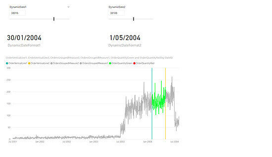
Next place the DynamicDate1 and DynamicDate2 as slicers and have them as single values and place them above the line and stacked column chart. Below them place the Card visual and drag the measures DynamicDateFormat1 and DynamicDateFormat2 into them. The final layout should look like this