
This is the first post in the Strategic colouring in Power BI series. Links to all the posts can be found here
https://capstoneanalytics.com.au/master-post-for-strategic-colouring-articles/
So you work in Sales. You want to compare revenue, profit, tax amount over the different business units. You want to see the relative position of a business unit over the other units for the three metrics . How would you do it ? This was precisely what one of our client was after. The following is a solution we provided. The Adventureworks dataset is used in this article to explain the concepts.
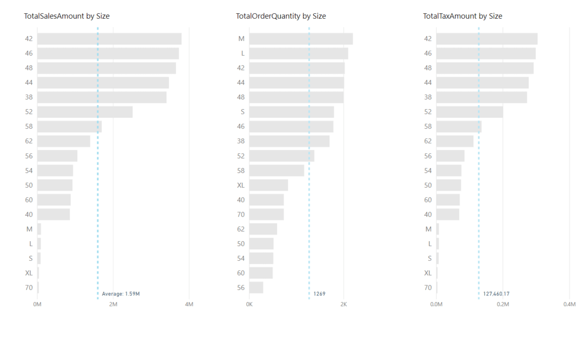
We will be visualising SalesAmount, OrderQuantity, and TaxAmt over the Product Size. I have chosen Product Size as the common dimension as there are more than 10 sizes and thus helps to get the point across.
Define 3 measures for the three metrics as follows
TotalSalesAmount =
SUM ( fctSales[SalesAmount] )
TotalOrderQuantity =
SUM ( fctSales[OrderQuantity] )
TotalTaxAmount =
SUM ( fctSales[TaxAmt] )
Next create a new table called ProductSize as follows. The column size will be used as a slicer in our report
ProductSize =
VALUES ( dimProduct[Size] )
Next place a clustered bar chart on a blank page. Drag DimProduct[Size] into the Axis field and drag [TotalSalesAmount] into the Vaue field. Make the data colour “#E6E6E6”. Go to the Analytics pane on the visual and add an Average line and show labels.
Repeat the above for [TotalOrderQuantity] and [TotalTaxAmount]. Your canvas should look like this
The aim is to apply conditional formatting on the bars so that it gives different colours when a bar is above or below the average, We need to define three measures to calculate the averages.
Average Sales =
CALCULATE (
AVERAGEX (
SUMMARIZE ( fctSales, dimProduct[Size], “SalesTotal”, [TotalSalesAmount] ),
[SalesTotal]
),
ALL ( dimProduct[Size] ),
NOT ( ISBLANK ( dimProduct[Size] ) )
)
Average Orderquantity =
CALCULATE (
AVERAGEX (
SUMMARIZE ( fctSales, dimProduct[Size], “QuantityTotal”, [TotalOrderQuantity] ),
[QuantityTotal]
),
ALL ( dimProduct[Size] ),
NOT ( ISBLANK ( dimProduct[Size] ) )
)
Average Tax =
CALCULATE (
AVERAGEX (
SUMMARIZE ( fctSales, dimProduct[Size], “TaxTotal”, [TotalTaxAmount] ),
[TaxTotal]
),
ALL ( dimProduct[Size] ),
NOT ( ISBLANK ( dimProduct[Size] ) )
)
The NOT ( ISBLANK ( dimProduct[Size] ) ) is used as I want to remove all the sizes which dont have a value in them
Next we will be defining three measures to get the right colours for the bars
SalesColour =
VAR selsize =
SELECTEDVALUE ( ProductSize[Size] )
RETURN
IF (
SELECTEDVALUE ( dimProduct[Size] ) = selsize
&& [TotalSalesAmount] < [Average Sales],
“#FD625E”,
IF (
SELECTEDVALUE ( dimProduct[Size] ) = selsize
&& [TotalSalesAmount] > [Average Sales],
“#003DFF”,
“#E6E6E6”
)
)
OrderQuantityColour =
VAR selsize =
SELECTEDVALUE ( ProductSize[Size] )
RETURN
IF (
SELECTEDVALUE ( dimProduct[Size] ) = selsize
&& [TotalOrderQuantity] < [Average Orderquantity],
“#FD625E”,
IF (
SELECTEDVALUE ( dimProduct[Size] ) = selsize
&& [TotalOrderQuantity] > [Average Orderquantity],
“#003DFF”,
“#E6E6E6”
)
)
TaxColour =
VAR selsize =
SELECTEDVALUE ( ProductSize[Size] )
RETURN
IF (
SELECTEDVALUE ( dimProduct[Size] ) = selsize
&& [TotalTaxAmount] < [Average Tax],
“#FD625E”,
IF (
SELECTEDVALUE ( dimProduct[Size] ) = selsize
&& [TotalTaxAmount] > [Average Tax],
“#003DFF”,
“#E6E6E6”
)
)
Now we are ready to apply conditional formatting. Select the first chart on the canvas and under Format go to Data colours and click on the three dots under Default colour and click conditional formatting. In the window that comes up select the following options and click OK
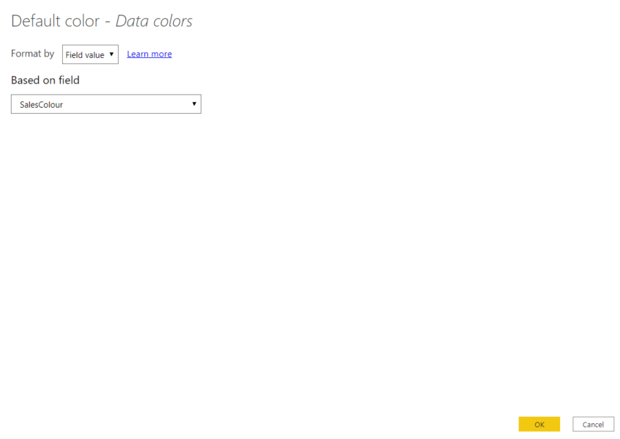
Repeat the above procedure for the second and third chart and replace SalesColour by OrderColour and TaxColour respectively
The charts are now conditionally formatted. Drag a slicer into the canvas and make it Single select. Drag ProductSize[Size] into the canvas (Remember to drag the right size column, the DimProduct[Size] should not be dragged here).
Select a size in the slicer and see the magic of selective colouring unfold.
Hi Abhijith,
Kudos to your effort, a great post !
I would appreciate if you can have a look to my query below. 🙂
I tried implementing your method on my own. In my scenario, I have one “Transnational Table” with [Debit Amount] & [Credit Amount]. I have taken Dim_Date[Month Name] as a common attribute as it has data for 10 months.
Now as we go step wise, I created same measures:
Step 1- CreditAmount = SUM(‘Transactional_Data(2019)'[ Credit Amount])
DebitAmount = SUM(‘Transactional_Data(2019)'[ Debit Amount])
Plotted two clustered bar chart with the above measures and dragged
Dim_Date[Month Name] into the axis. Also, added average line.
Step 2- Created two Average measures like:
Average_CreditAmt = CALCULATE(
AVERAGEX(
SUMMARIZE(‘Transactional_Data(2019)’,Dim_Date[Month Name],”Credit”,
[CreditAmount]),
[Credit]
),
ALL(Dim_Date[Month Name]),
NOT(ISBLANK(Dim_Date[Month Name]))
)
Average_DebitAmt = CALCULATE(
AVERAGEX(
SUMMARIZE(‘Transactional_Data(2019)’,Dim_Date[Month Name],”Debit”,
[DebitAmount]),
[Debit]
),
ALL(Dim_Date[Month Name]),
NOT(ISBLANK(Dim_Date[Month Name]))
)
Step 3- Created below measures for Conditional Formatting
DebitColor =
VAR month=
SELECTEDVALUE(MonthName[Month Name])
return
IF(
SELECTEDVALUE(Dim_Date[Month Name]) = month
&& [DebitAmount] [Average_DebitAmt] ,
“#003DFF”,
“#E6E6E6”
)
)
Step 4- Created a table for slicer: MonthName = VALUES(‘Dim_Date'[Month Name])
After implementing the above steps, I’d few issues:
1. My slicer doesn’t slice both the bar charts, do we need to create a relationship between the tables ?
2. In your video above, how come your Y-Axis is static and not getting filtered by the size filter ?
Utter confused.
Hi Himanshu,
Glad you found the post useful.
I have replicated your data and your measures. The error is in the measures for conditional formatting. You have to define three conditions 1) for > than average, 2) for < than average and 3) for the default state. I will send you the workbook to your email and you can take it from there.