
This is the fourth post in the Strategic colouring in Power BI series. Links to all the posts can be found here
https://capstoneanalytics.com.au/master-post-for-strategic-colouring-articles/
In the previous post, we looked at how to isolate a category in a trend
We will add on this in this post and see how to isolate and visualise YTD data.
We have a simple data model with a sales table and a date table. There is sales data for 16 years in the model and we want to visualise the YTD performance for each year.
We define two measure as follows
Total Sales =
SUM ( Sales[Revenue] )
YTD Sales =
TOTALYTD ( [Total Sales], ‘Date'[Date] )
Next drag a line chart into the canvas and drag Date into Axis and [YTD Sales] into Values. The chart looks like this
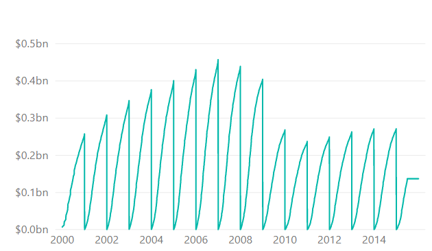
Not quite what we wanted but the chart does exactly what its supposed to be doing. It calculates the YTD for year 2000 and when it reaches January 1 2001 it resets and starts from 0 and continues for the next year. This happens for all the years in the model.
What we want is a chart which show the YTD for each year starting from 0 so that they can be compared against each other. We can easily achieve this. Remove the Date filed and drag MonthName into the Axis and drag Year into Legend. The chart looks like this
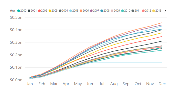
This is exactly what we were after. Each YTD starts at 0 and now we can compare the performance of each years’ YTD against the other years. But the problem is there is too much data and its hard to focus on one year.
This is where we apply the concepts of strategic colouring. For this we need to define a measure to calculate the YTD for each year. For ex
YTD Sales 2000 =
VAR selyear = 2000
RETURN
IF (
selyear IN VALUES ( ‘Date'[Year] ),
CALCULATE ( [YTD Sales], ‘Date'[Year] = selyear ),
BLANK ()
)
Use the logic above and calculate YTD for all the years for which there is Sales in the model. This has to be done manually currently, hopefully with the introduction of calculated groups this can be automated in the future. In our case we have defined 16 YTD measures from 2000 to 2015
Create a copy of the Date table and call it Date 2. Next define this measure
TotalSalesAmountSelectedYear =
IF (
ISFILTERED ( ‘Date 2′[Year] ),
CALCULATE ( [YTD Sales], TREATAS ( VALUES ( ‘Date 2′[Year] ), ‘Date'[Year] ) ),
BLANK ()
)
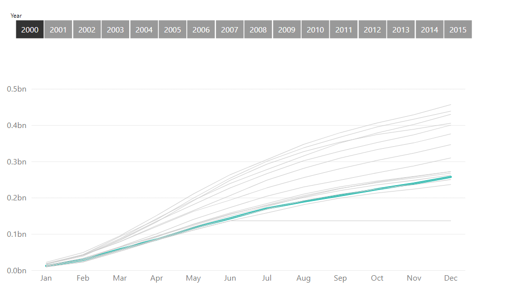
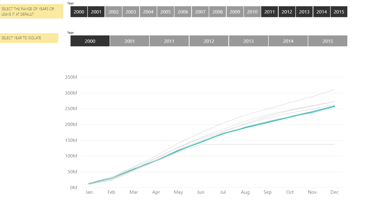
In the line chart above remove the Year from legend and drag the 16 measures and the above measures into Values and make the colour of the 16 YTD measures as grey and the above measure as green
Next drag Year from Date 2 table into a slicer and with some formatting the chart should look like this when Year 2000 is selected
We can to one step further and pick the range of years we want to analyse. For this place the Year from Date table into another slicer and place it above the slicer created above. We can now narrow down our focus by selecting range of years in the first slicer. We also want to make sure that when we select a range the second slicer is also filtered. For this we define a measure called
FilteredYear =
VAR selyear =
VALUES ( ‘Date'[Year] )
RETURN
IF ( MAX ( ‘Date 2′[Year] ) IN selyear, 1, 0 )
Place this measure as a filter on the bottom slicer and set it to be equal to 1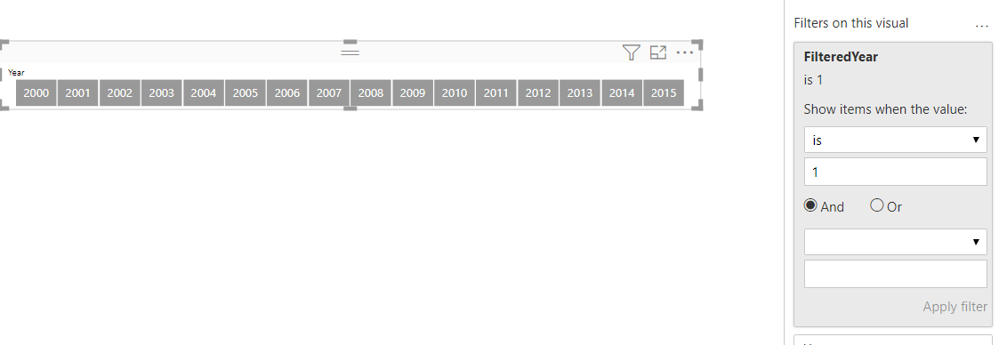 .
.
Now whenever the range in the top slicer changes it will filter the bottom slicer. You can then chose the year from the bottom slicer to isolate the YTD for the year of your choice.
Add some text for user prompt and the final setup looks like this after a few selections are made
Link to interactive report here