This is the sixth post in the Strategic colouring in Power BI series. Links to all the posts can be found here
https://capstoneanalytics.com.au/master-post-for-strategic-colouring-articles/
In the fifth post, we showcased how to visually determine the difference in sales from a base year for different segments
In this instalment we will discuss how to visually display the top 10 products on a yearly basis
Creating a Top 10 chart in Power BI is very easy. You select the Products and apply a top 10 filter on it on the metric of your choice. But what if you wanted to create a top 10 chart for the products on a yearly basis.
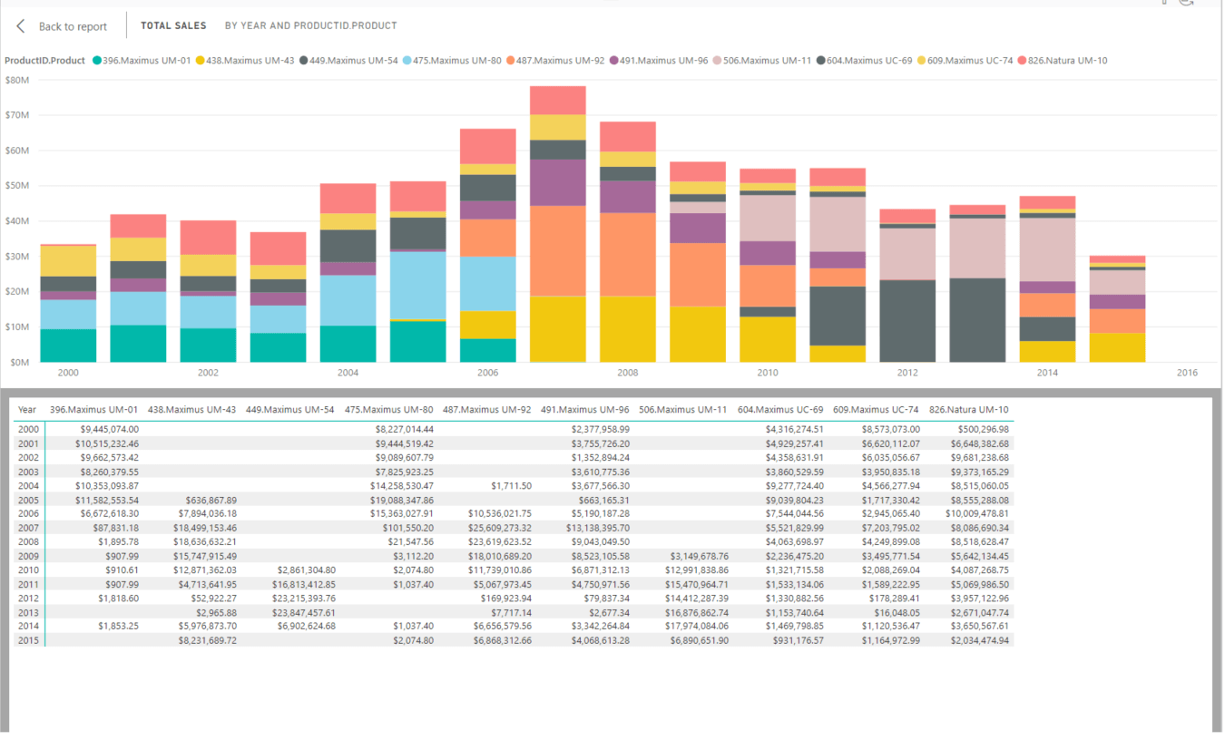
This is easy as well. We create a bar chart and drag Year into Axis and [Total Sales] into Value and apply a top 10 filter on the visual on the ProductID.Product column. We also want to see what are the top products so we drag ProductID.Product column into Legend. The setup looks like this.

Now the Total Sales for all the years is $5.13bn so the above chart looks a bit suspicious. The maximum sales of the top 10 products for a year is in 2007 and its only $80mn. Lets investigate this further. Lets click on the ellipses on the top right hand corner and select Show as a table to get this view

We see some gaps in the data. In some years there are no sales against some products. So what is happening here ? The top 10 filter we applied on this chart is the top 10 products for all sales for all the years. Hence while there might be products like 449.Maximus UM-54 which is in the top 10 products for all years it may not be in the top 10 for some years. We take note of this and move on as for this exercise we do not need a chart which shows the yearly top 10 values. We will cover that in future posts.
Remove the ProductID.Product column from the legend in the chart. We want to highlight any product in the chart by selecting a product from a slicer. We place the ProductID.Product column into a slicer and apply a top 10 filter on it so that only the top 10 products are shown. But when we select any product the chart is filtered and we do not want that. In order to highlight the products we do the following
We have managed to highlight the products but we do not stop here. We want to know in which years is the selected product the top selling product. And we will use strategic colouring to achieve it.
For this we create a copy of the Products table and call it Products 2 and define four measures as follows
TopProduct =
VAR topprod =
TOPN ( 1, VALUES ( Products[Product] ), [Total Sales] )
RETURN
topprod
Total Sales Top Product =
VAR table1 =
SUMMARIZE (
Sales,
‘Date'[Year],
Products[ProductID],
“SalesProducts”, [Total Sales]
)
RETURN
IF (
[TopProduct] = SELECTEDVALUE ( ‘Produts 2′[Product] ),
0,
MAXX ( table1, [SalesProducts] )
)
Total Sales Top Product =
VAR table1 =
SUMMARIZE (
Sales,
‘Date'[Year],
Products[ProductID],
“SalesProducts”, [Total Sales]
)
RETURN
IF (
[TopProduct] = SELECTEDVALUE ( ‘Produts 2′[Product] ),
0,
MAXX ( table1, [SalesProducts] )
)
Total Sales Other Products =
[Total Sales] – [Total Sales Top Product] – [Total Sales Selected Product]
We place the last three measures on a stacked column chart under Value and drag Year into Axis. We make the [Total Sales Selected Product] green so that it stand out and the other two shades of grey. Now you can use the same filter from above to select a product and see in which years it is the top selling product. There are some products in the overall top 10 which were never the top selling product in any year.
