
This is the eighth post in the Strategic colouring in Power BI series. Links to all the posts can be found here
https://capstoneanalytics.com.au/master-post-for-strategic-colouring-articles/
Stacked column charts are hard to visualise especially when you have more than four “stacks” and if one of them predominates its harder to visualise even with using the right colour gradients.
There needs to be a better way to visualise stacked column charts and a recent problem I have been working on provided me with an opportunity to do so. I wanted to visualise client debts by month broken down into five bands. The chart looked like this when all the formatting was applied
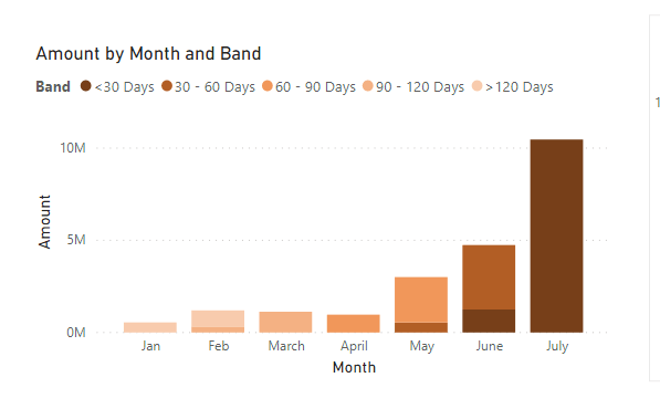
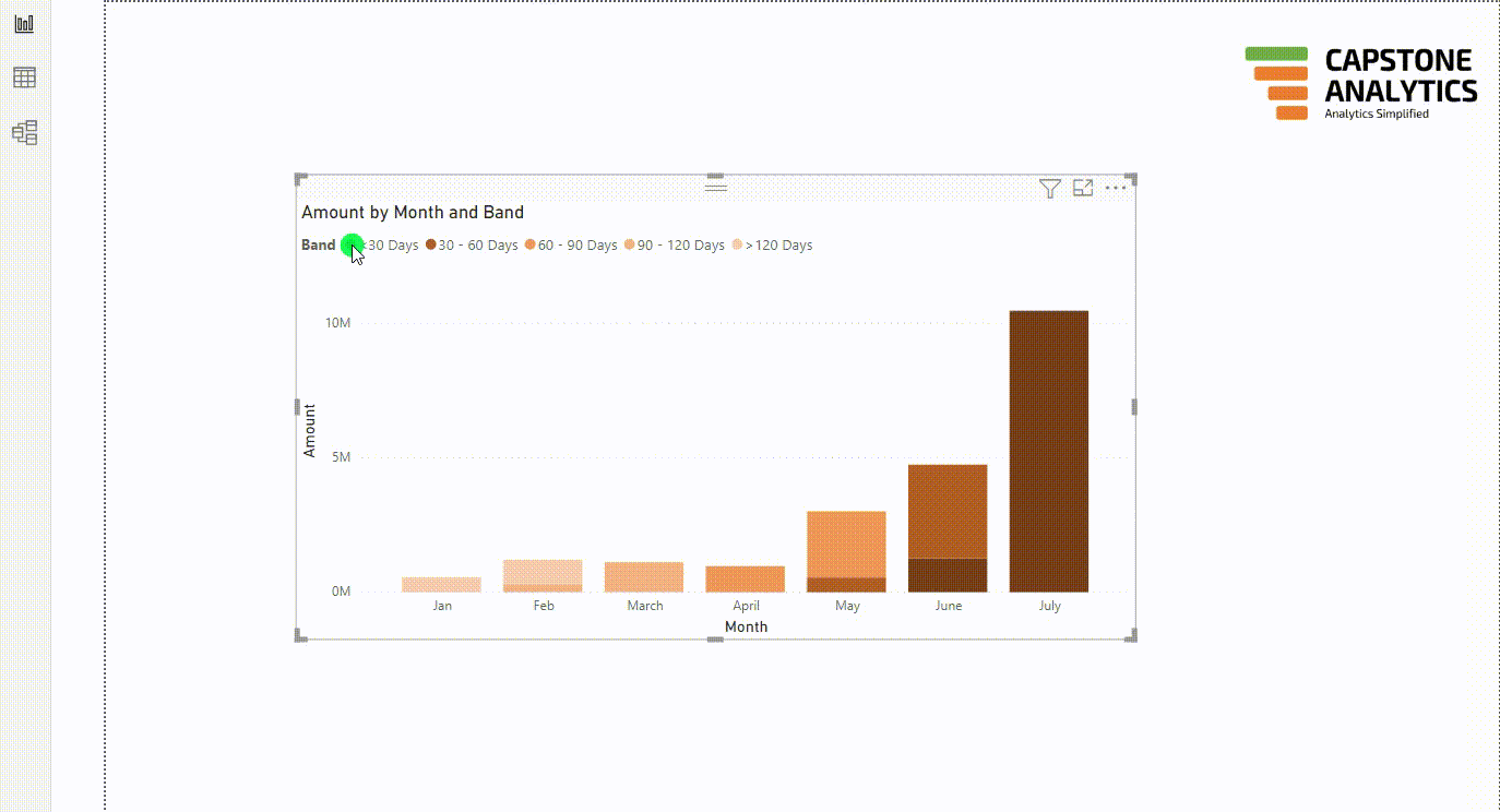
As you can see its hard to visualise this chart as your eyes go back and forth between the chart and the legend to see what the bands are. You can click on the legend like below to isolate an individual band but its not the best user experience. So lets see if we can improve upon this.
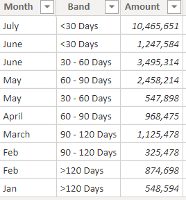
Our Debt table looks like this and it is connected to the Band table having Band as a column in a many to one relationship
We first define a measure which will give the debt for the selected band.
Selected Debt =
IF ( ISFILTERED ( Band[Band] ), SUM ( Debt[Amount] ), 0 )
We then define five measures for the five bands. An example is given below
Debt <30Days =
VAR selband =
VALUES ( Band[Band] )
RETURN
IF (
“<30 Days” IN selband
&& ISFILTERED ( Band[Band] ),
0,
CALCULATE ( SUM ( Debt[Amount] ), Band[Band] = “<30 Days” )
)
What we are doing here is anytime the band “<30 Days” is selected in the slicer and if the column band is filtered the debt amount is shown as zero else the debt amount is shown for that band. This is the opposite of what we normally do because we already have a measure [Selected Debt] which gives the debt amount for the selected band.
We define the other four measures replacing “<30 Days” with the appropriate band.
We also define another measure to get the percentage debt in the selected bands
Selected Debt% =
[Selected Debt] / CALCULATE ( SUM ( Debt[Amount] ), ALL ( Band[Band] ) )
We are ready to visualise the data. In the stacked column chart visual drag Month into Axis, and the first six measures which we defined into Values. Make the colour of [Selected Debt] measure as something which stands out (say Orange) and others as grey. The set up should look like this
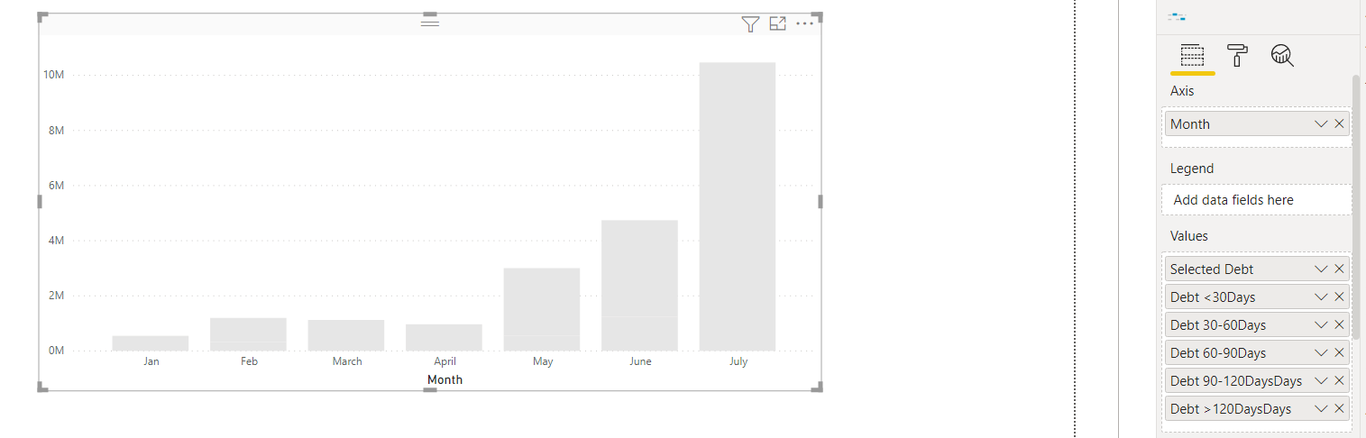
No band is highlighted as we have not yet selected a band from the slicer. Drag the Band column from the Band table into a slicer. Import the “Data story” custom visual and place it on the canvas and drag [Selected Debt%] into data values and under the Story section of the visual write this text “The selected band(s) account for # of all debts”
Now we are good to visualise our data