
In this post we will discuss how to transform a basic line and column chart into a chart which prompts the user to take action.
We have line and column chart below which shows daily sales as columns and an average daily sales line (Day number of month as Axis and [TotalSalesAmount] as Values
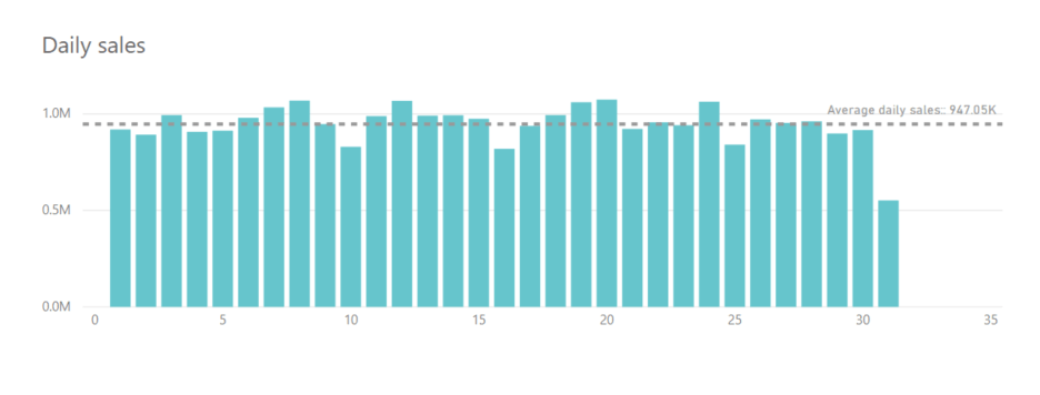
While this is a good enough chart to gives the daily sales, the user must exert a great deal of effort in order to determine on which days are the sales higher/lower than the average. Wouldn’t be better if we design a chart so that the user immediately knows the variance in sales ?
We can do this by calculating the Average daily sales as a measure as follows
Average Daily Sales =
CALCULATE (
AVERAGEX (
SUMMARIZE (
‘Sales’,
‘Calendar'[DayNumberOfMonth],
“Selected Measure”, [TotalSalesAmount]
),
[Selected Measure]
),
ALL ( ‘Calendar’ )
)
We then calculate the daily variance as
Daily variance = [TotalSalesAmount] – [Average Daily Sales]
Replacing [TotalSalesAmount] in the above chart with the Daily variance measure and using the appropriate colours we get the following chart
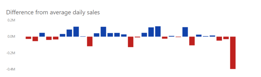
This chart clearly indicates days which has positive variance (as blue bars) and days with negative variance (red bars). The user now can immediately get insights on the daily sales variances.