The inspiration for this article comes from the app Webull which is a stock market app for investors which includes real time quotes, financial news, investing advice etc. It is one of the best apps in the market if you are a frequent investor in the stock market. It is an extremely well-designed app with an awesome user interface which makes it a pleasure to use.
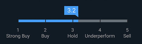
The visual below is from the app and is the recommended rating for a stock by Wall Street analysts. This is a great visual and you immediately know if the stock is worth buying or not. In this case you are better off holding on to it if you have purchased it or hold off on purchasing till the ratings improve on the stock.
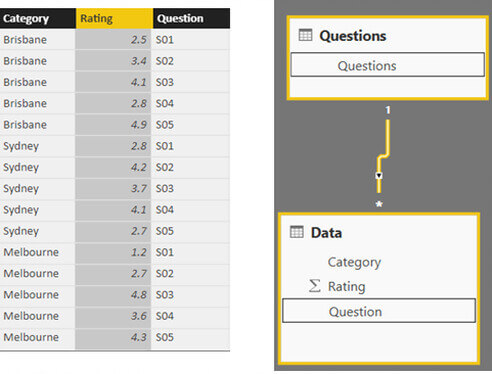

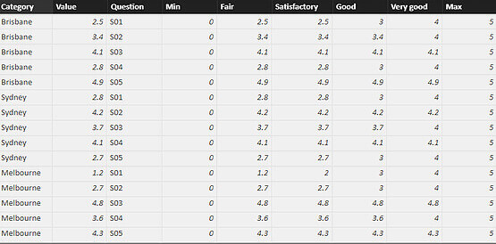
Fair = Max([Value],1)
Satisfactory = Max([Value],2)
Good = Max([Value],3)
Very good = Max([Value],4)
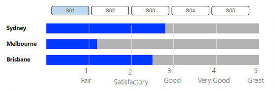
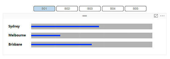
With a little bit of formatting and text I got the chart I was looking for