
Power BI works on great relationships, but sometimes we need to solve a problem without any relationships. Enter the disconnected tables. These are very useful to solve specific problems. They are easy to set up and you can be as creative as you want with your DAX to achieve your end results.
In this post we will look at how to change the line colour in a chart based on values in a disconnected table. No conditional formatting is used and no relationships either.
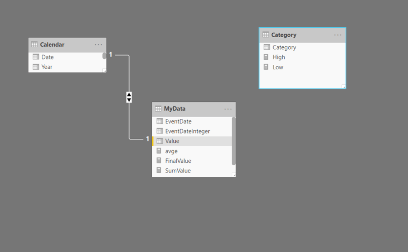
We have a simple data model with three tables. A calendar table which has a one to many relationship with a MyData table and a Category table which is disconnected from the model. The metric to evaluate is the column Value in the MyData table. The column Category in the Category table has three values – Low, Medium, High
First we will define two measures for sum and average
SumValue =
SUM ( MyData[Value] )
avge =
CALCULATE ( AVERAGE ( MyData[Value] ), ALLSELECTED ( ‘MyData’ ) )
Next we will define the boundaries for the categories by defining two measures
Low = 1815
High = 1820
Next we will define our final measure to place in the charts
FinalValue =
VAR selvalue =
SELECTEDVALUE ( Category[Category] )
RETURN
IF (
selvalue = “Low”
&& [avge] <= [Low],
[SumValue],
IF (
selvalue = “Medium”
&& [avge] > [Low]
&& [avge] < [High],
[SumValue],
IF ( selvalue = “High” && [avge] >= [High], [SumValue] )
)
)
This measure will select the appropriate category when one of the condition is satisfied. The way to achieve it is by placing the line chart visual into the canvas and drag Date from the Calendar table into the Axis and Category column into the Legend. Next we will place the measure [SumValue] into Values. This is a temporary step as we need to change the colours for the three categories under Data colours in the Format pane. Once we have assigned the right colours we replace the [SumValue] measure with [FinalValue] measure in the chart
We can now drag the Date column into a slicer and interact with it and see how the line colour changes.