Let’s see how to achieve this in Power BI. Consider the data model below
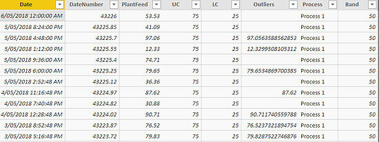
1. Date column in datetime format
2. DateNumber which is Date column in decimal format
3. 5 days worth of Plant feed data
4. Process column consisting of three processes
5. UC (Upper Control Limit) of 50
6. LC(Lower Control Limit) of 25
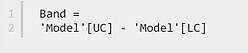
Column Band is defined as:
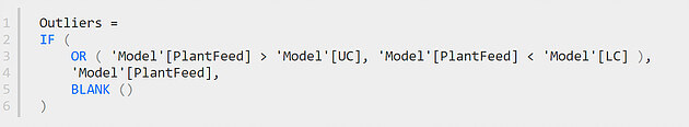
Column Outliers is defined as:
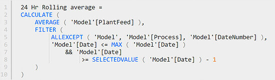
Lets define a measure and call it 24 Hr rolling average:
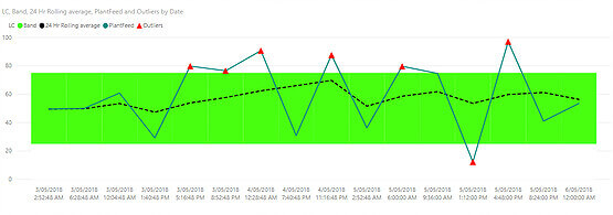
1. Create a stacked column chart
2. Put Date in Axis and LC & Band under Values
3. With the visual selected go to Format -> X-Axis-> Inner Padding and make it 0.
4. Change the color of LC to white and Band to green. It should look like this
5. Select the visual and convert into a Line and Stacked Column chart
6. Put 24 Hr Rolling Average, PlantFeed, and Outliers under Values
7.Apply a visual level filter to only show data for last 24 hours
8.Hide the line for Outliers and show only the markers and display it as Red
9.Format the other two lines so that the final chart is like below