
Deciding which colours to use in a report is never an easy decision as each one of us has our own preferences. Someone will always be disappointed with the choice of colours used in your reports. One way around this is to conduct a survey of the colours to use in a report and incorporate it in your data model and give options for the users to select their own colours.
Let’s say we have conducted a survey and have selected five sets of colours. Create a table called Colour in your data model which might look like this
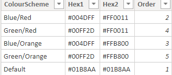
I have copied the hex colours for each set of colours and entered them into the columns Hex1 and Hex2. Make sure to sort the column ColourScheme by the Order column
Using the adventureworks model we will define a variance measure. I want to plot the variance by countries and wanted countries with positive and negative variances hence chose an arbitrary number of 4000000 to achieve this
Variance =
[TotalSalesAmount] – 4000000
Next we will define the colour scheme measure by using the Colour table and the above measure
VarianceColourScheme =
VAR SelectedColour =
SELECTEDVALUE ( Colour[ColourScheme] )
VAR Hex1Colour =
VALUES ( Colour[Hex1] )
VAR Hex2Colour =
VALUES ( Colour[Hex2] )
RETURN
SWITCH (
TRUE,
[variance] > 5000000, Hex1Colour,
[variance] < 5000000, Hex2Colour
)
Basically if the variance is positive use a colour usually associated with positive differences (Hex1) else chose the other option (Hex2)
Next create a stacked bar chart and drag SalesTerritoryCountry into Axis and Variance into Value
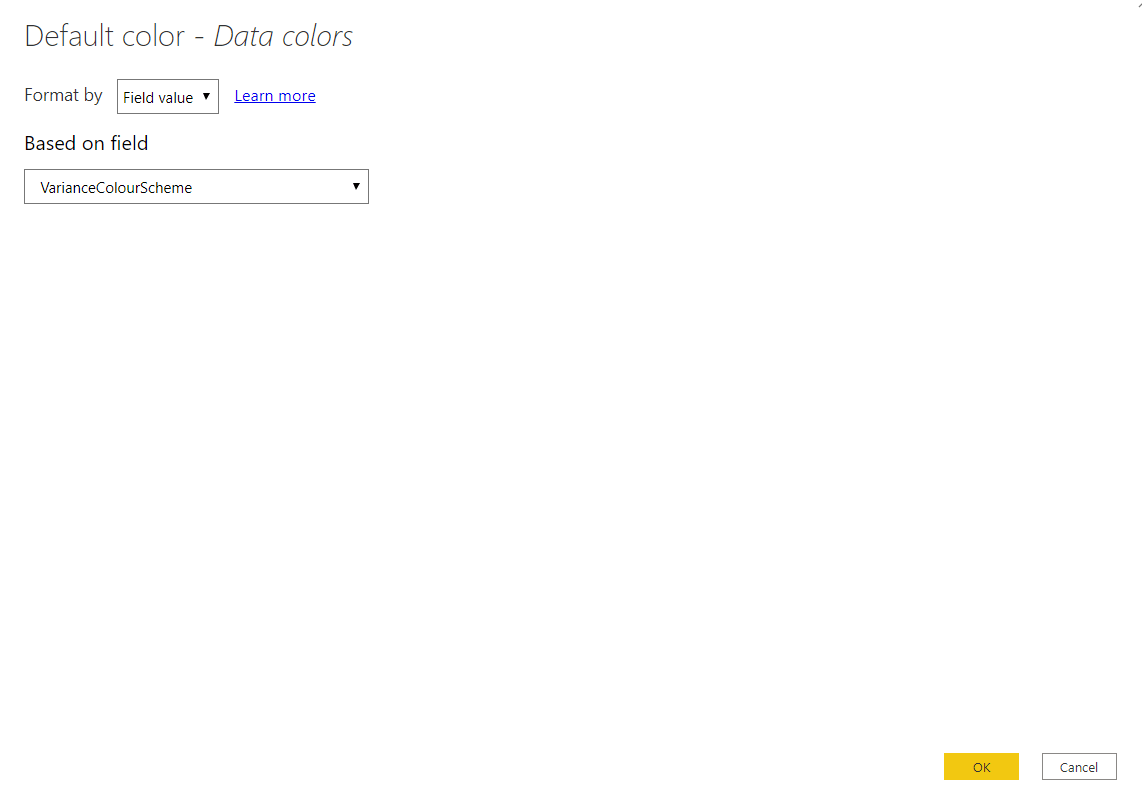
With the chart selected, in the Format pane go to Data Colour and use the … to select Conditional Formatting and use the following option
Next create a Slicer and drag ColourScheme column from the Colour table into it and make it single select
You can now select a colour scheme and watch how the colours change in the chart.
With a bit of work you can set this up for all the charts in your reports and have the slicer in the front page of your report so that the users can select the colour scheme of their choice