
Heatmaps are a great way of showing complex data in an easily understandable manner. In a heatmap, you have rows and columns and at the intersection of each row and column you have a value. Typically you are not interested in the individual values and want to see the pattern of all the values. Generally heatmaps are colour coded from the lowest value to the highest value
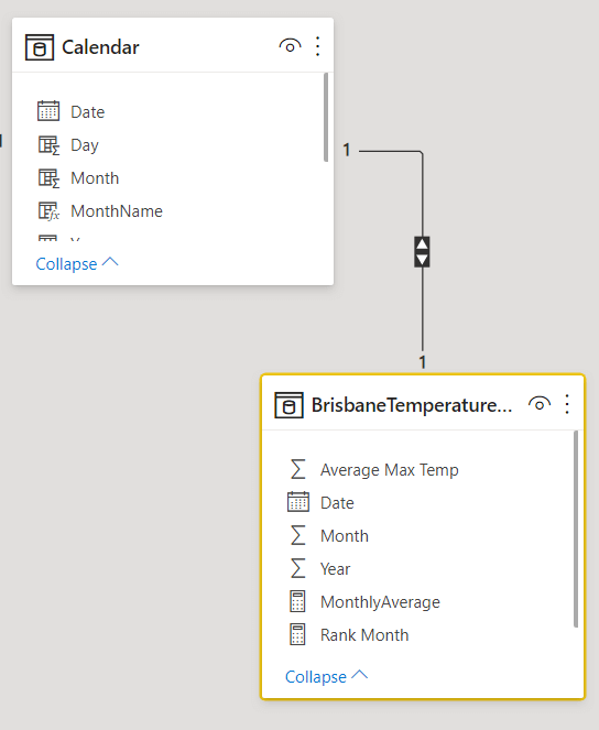
In this example we have a simple data model like this where there is a one to one relationship between the Calendar table and the BrisbaneTemperatureAvgMonthly table which contains the average maximum temperature at a weather station in Brisbane from 2000 to 2019
 .
.
We define our monthly average measure as follows
MonthlyAverage = SUM ( BrisbaneTemperatureAvgMonthly[Average Max Temp] )
We then create a heatmap as follows. The process of creating a heatmap is not explained here as there are plenty of tutorials which explain how to do it.
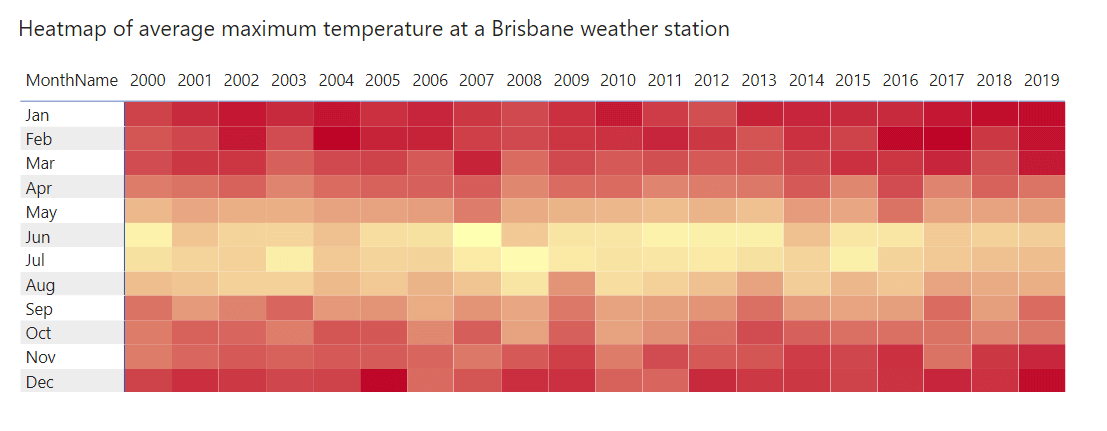
The heatmap gives us a graphical representation of the average maximum temperature over 20 years for all months. The lighter colours denote lower temperatures while the brighter red colours denote higher temperatures. If you live in the southern hemisphere this is exactly what you would expect as our summers are from Dec to Feb which has the higher temperatures and the winters are from Jun to Aug which has the lower temperatures. So even though this is a nice heatmap it doesn’t tell us anything new.
So how can we make this better ?
What if we rank each cell (intersection of year and month) based on the value of the cell on a monthly basis. So for January, each cell will have a value from 1 to 20 with 1 being the highest value and 20 being the lowest value. We continue doing it for each month of the year. So we will have a ranking matrix which will rank each year from 1 to 20 for each month.
For this we need to use the RANKX function as follows
Rank Month = RANKX ( ALLSELECTED ( ‘Calendar'[Year] ), [MonthlyAverage] )
In the above heatmap we then replace the MonthlyAverage measure with the Rank Month measure and conditionally format the cells with a rank of 1 to give it a white colur
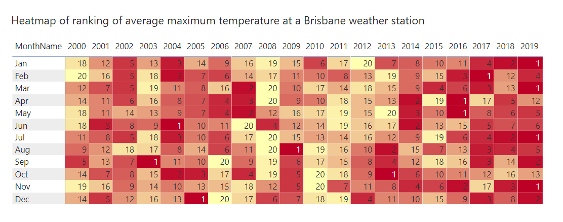
We now have a heatmap which gives us fascinating insights. We can see that 7 of the 12 months have a ranking of 1 in the last four years. That means the highest average maximum temperature for 7 of the 12 months occurred in the last four years. We would not have been able to generate this insight from the first heatmap. But using a single line of code we are able to generate useful insights.